

Letters and Legacy: Designing R&J’s 40th Anniversary Logo
Forty years is a long time to do anything. For a communications agency, it’s long enough to have worked in a world before the internet, before social media, before the entire infrastructure of how information moves changed underneath the industry’s feet more than once. R&J Strategic Communications opened its doors in 1986. The agency that exists today shares the same name, the same founding commitment to making a difference for its clients, and very little else with that original version. That evolution is a story of incremental change.
Telling it starts with the logo.
A logo is the part of an organization’s story that people experience first. Before a single word is read, the mark has already communicated something: the kind of organization this is, what it values, and whether it’s kept up. That signal compounds over time and becomes the face that people come to know. Every campaign, every investment, and every adaptation gets pressed into what people see when they look at it. As we mark 40 years, we’re looking back at how our logo has evolved alongside our business, and what those changes say about where we’ve been and where we’re headed.
Forty Years of Logos
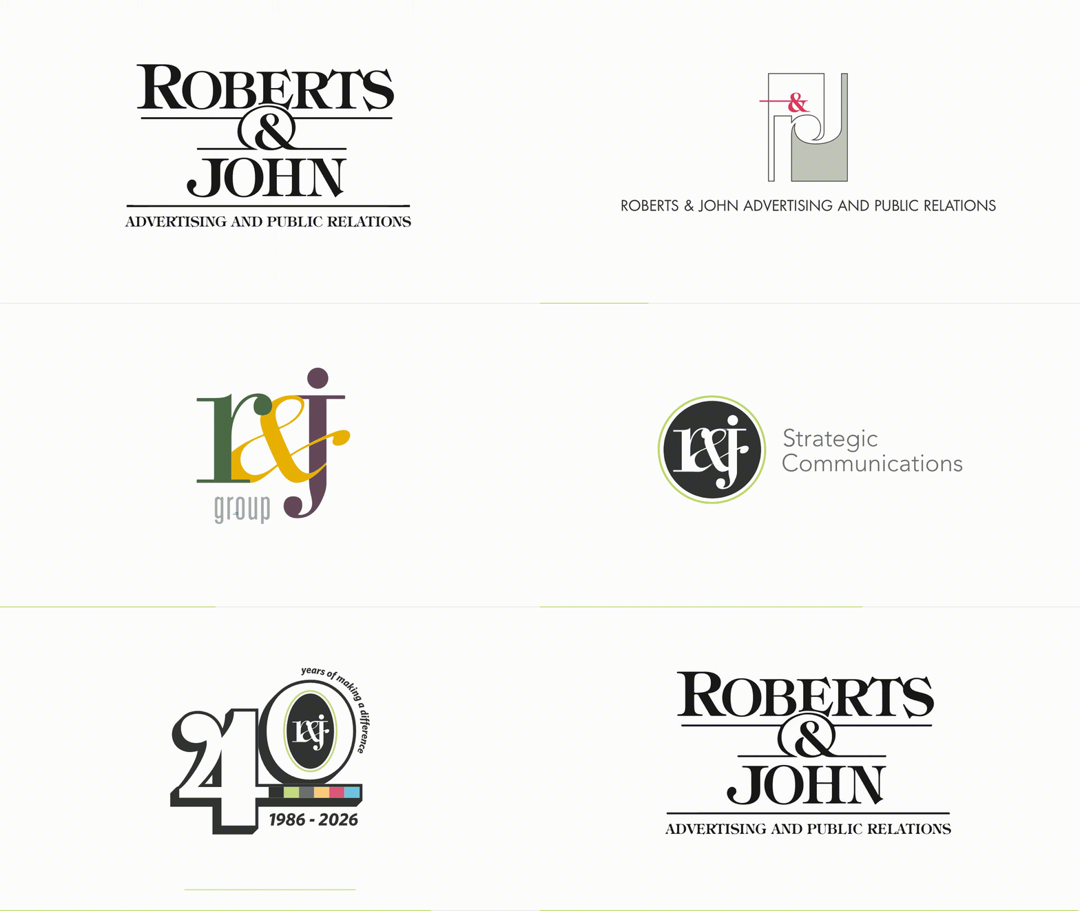
1986: Roberts & John Advertising and Public Relations
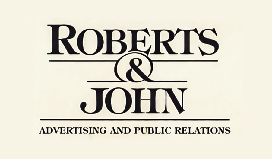
Bob Wille, one of the founding partners, designed the original identity. Records of the precise typeface from which the logo was derived have been lost to time. But the letterforms appear to be modified versions of ITC Tiffany Demi, based on the typographic characteristics:
- Vertical stress in the bowls of the capital letterforms.
- Sharp contrast between thick and thin strokes.
- The diagonal stroke in the capital “N” doesn’t stop when it meets the stem on the right, but instead flares out like a serif.
- The capital “J” descender sits on the baseline as opposed to extending beyond it. The descender also widens the “J” and ends in a rounded finial.
- The flared horizontal bars on the capital “E” and “T”, with matching Old Style serifs that are angled outwards on the capital “S”
- The leg of the capital “R” kicks straight out instead of curving upward.
Being a combination of two Old Style typefaces, Caxton and Ronaldson, ITC Tiffany’s traditional aesthetic helped to convey a sense of credibility and professionalism expected of an agency at the time. The logo established the firm as a partnership rooted in its founders: two Roberts and one John. The words “Advertising and Public Relations” told anyone looking exactly what the firm did: full-service communications, built on relationships, grounded in legacy disciplines like media buying, creative and press relations. An identity designed to establish trust in a market where the agency was new and unknown.
Circa 1990: The R&J Monogram
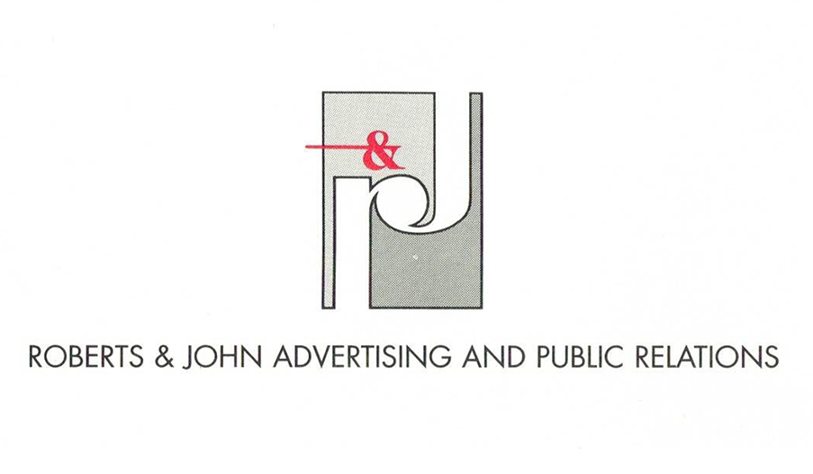
Bob Wille parted ways shortly after the agency’s founding, but the “Roberts & John” name was retained. The firm’s leadership had clarified to one Robert and one John. Founding partner Bob Gagauf redesigned the logo around that fact using Futura, a geometric typeface originating from the Bauhaus movement of the 1920s. Throughout the 1960s to the 1980s, Futura made big splashes in the public eye, from the Apollo 11 lunar plaque to the bold collage works of Barbara Kruger to the wordmark on the NIKE logo at the time. Using Futura as the basis for a stylized monogram signaled a transition from a founder-based identity to a brand-forward organization with the potential to grow. Using a concise logomark instead of a wordmark made the brand more concise and easier to use across materials. This decision treated design as a strategic choice rather than just a functional one. The interlocking letterforms reinforced what the firm was becoming: a partnership where the sum was greater than the parts.
2001: R&J Group
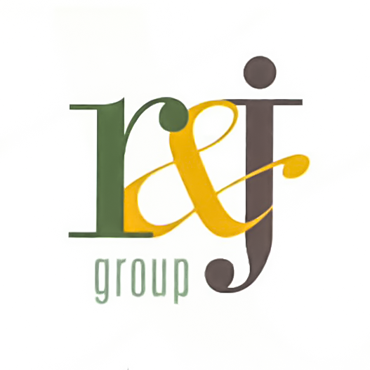
As the communications landscape in the late 1990s and early 2000s became increasingly digital, so too did R&J by leveraging the emerging technologies to expand beyond traditional services into more strategic and integrated communications offerings. Andrew Camaratta, Creative Director at the time, designed the R&J Group logo to reflect that the agency had moved well past its original scope. The updated monogram used Bauer Bodoni, classified as a Didone typeface, as a base with some modifications to make it unique to R&J:
- Using the capital “J” as the body to support the dot of the lowercase “j”
- Lengthening the height of the “r” to match the cap height of the “j”
- Increasing the angle of the slant for the italic ampersand “&”
The choice to use lowercase letterforms softened the logo to communicate a sense of accessibility, adaptability, and forward-thinking culture. The introduction of color suggested creativity, diversification of services, and a break from strictly corporate aesthetics. The addition of “group” in Univers Ultra Condensed indicated a broader organizational structure and the potential to grow multiple practice areas, specialties, or subsidiaries. Overall, the update signaled that R&J had evolved into a modern, flexible communications firm that embraced the complexity of the digital age and integrated marketing.
2005: R&J Public Relations
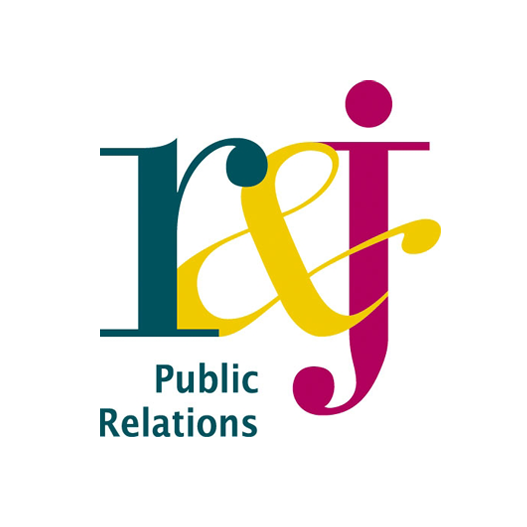
As the agency honed its craft on integrated communications, R&J found its niche in healthcare and corporate communications. The expertise borne from this client work led to a sharper focus on crisis communications, healthcare leadership, and early social media. To reflect this change, “group” was changed to “Public Relations”, set in Lucida Grande, in the logo. Lucida Grande was the main system font for macOS from around 2001 to 2014. In 2005, this would’ve meant the agency was trying to move with the updates in technology that were rapidly developing. Thus, highlighting R&J’s core competencies to remain agile in a media landscape that was beginning to fragment.
2015: R&J Strategic Communications
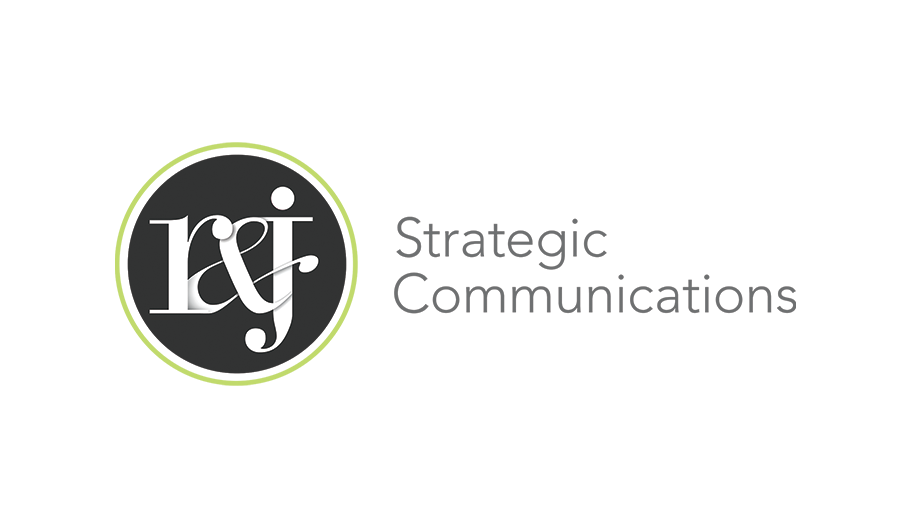
Steve Guberman, then VP of Creative and Digital Services, designed the mark still in use today. “Strategic Communications” set in Whitney replaced the previous workmark and repositioned R&J from service provider to strategic partner. The identity reflected full adoption of the PESO Model© (Paid, Earned, Shared, Owned) and a deeper investment in analytics, audience targeting, and data-driven storytelling. Where earlier marks had signaled growth or specialization, this one signaled authority. “R&J” had become a brand with its own meaning, no longer just the initials of its founders, but a name synonymous with strategic insight and integrated execution across industries.
Five marks across 40 years. Each one was a decision about what the agency was and where it was headed. The question for the anniversary was what number six should say.
The Anniversary Logo
Ideating & Sketching
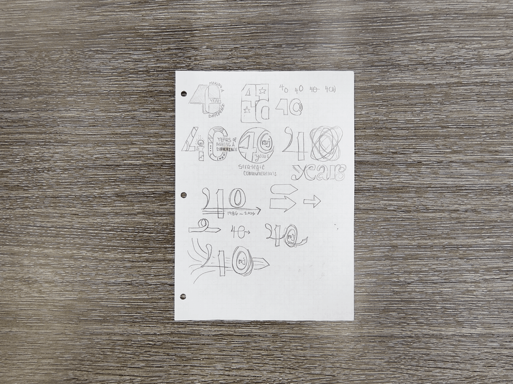
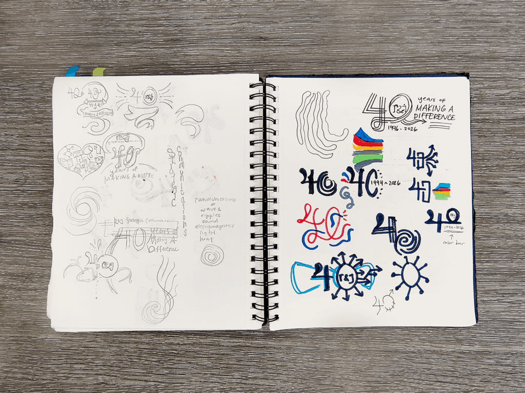
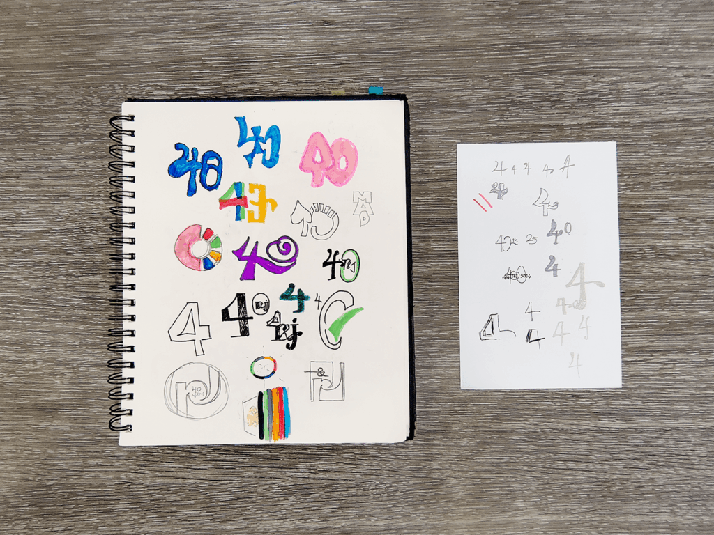
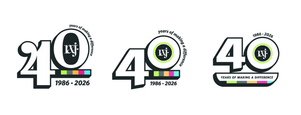
Sketches are meant for exploring possibilities and playing with ideas. Polish and refinement come later. The emphasis needed to be on the anniversary year and be visually distinct, but still in the same aesthetic language as the R&J Strategic Communications logo. After reviewing the conceptual options I had put together, I decided on three directions to develop further: (left to right) Liberal usage of color and graphical elements, bolder treatment of the monogram logomark with the brand fonts, and a more editorial concept using a typeface based on the logomark letterforms.
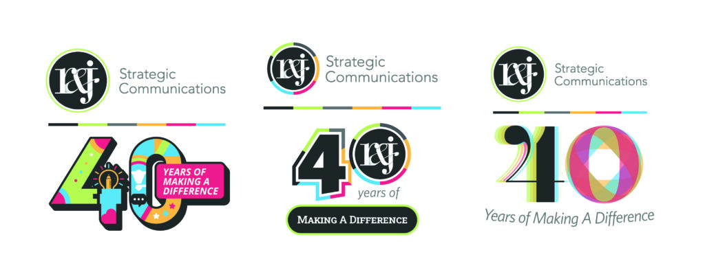
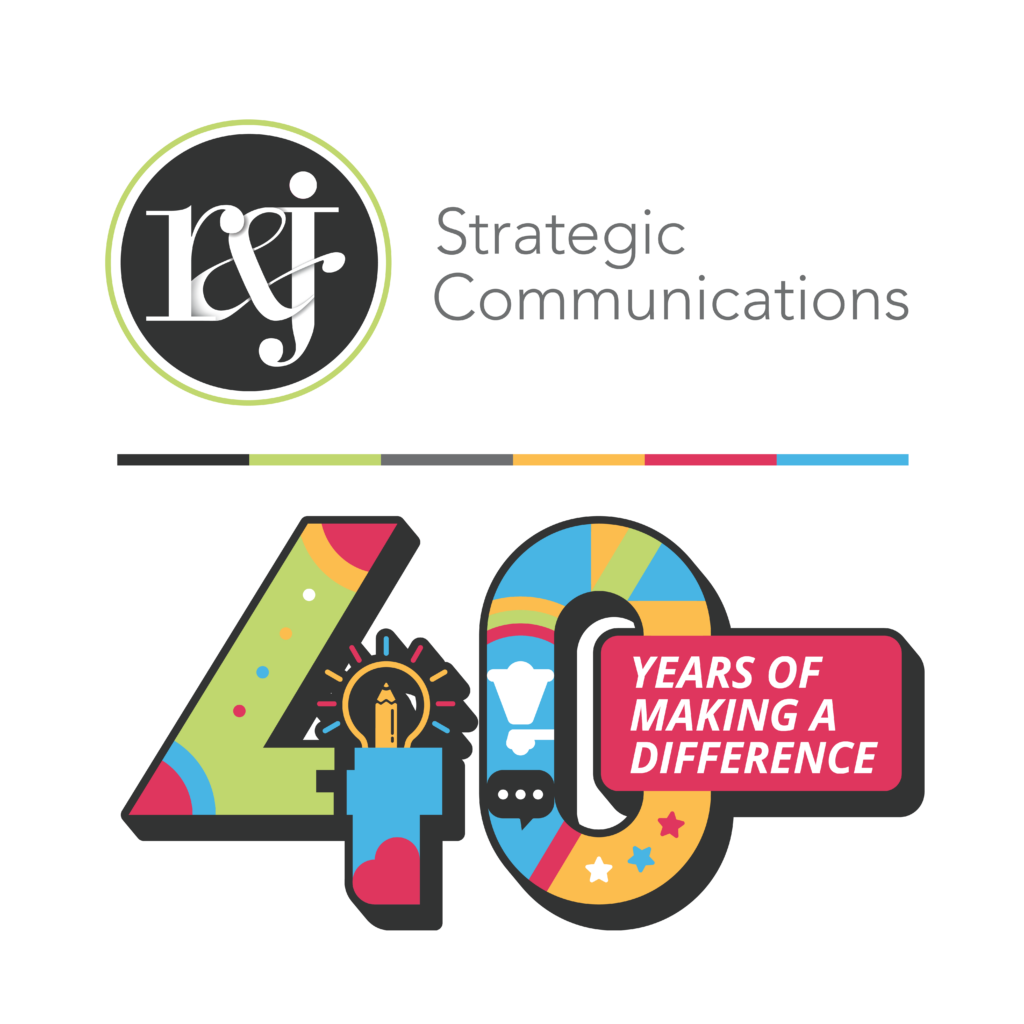
Concept One: Bold and Graphic
R&J’s communications work spans across public relations, digital marketing, graphic design, and more. This concept focused more on showing rather than telling. Bold, saturated color fills across the geometric numerals. Our custom iconography worked directly into the interior space of the digits: lightbulbs, megaphones, visual references to digital media, creative work, PR, and communications. All of these elements are anchored together with a banner treatment of the tagline.
B2B design often treats restraint as sophistication, but it isn’t the only option. Bold visuals can be more than for consumer brands. They hold attention and stake a claim. Forty years is a big milestone, and this direction treated it that way.
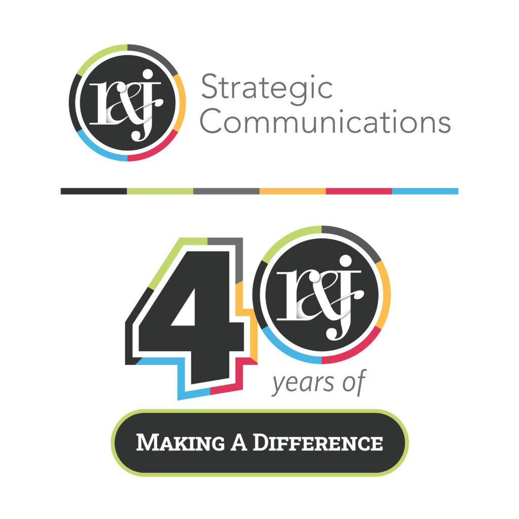
Concept Two: The Monogram Mark
This direction took the elements of our current logo and applied them to fit the 40th anniversary. The existing color bar (black, green, gray, yellow, red, blue) expanded from a divider into a stroke that encircles the logomark itself, as in the “0”, adding tension without competing with the mark. The “4” and “years of” were set in Whitney, the primary typeface from the 2015 rebrand, as a direct reference to that era. The tagline in Roboto Slab, our current display font.
Concept Three: An Editorial Push
For the last direction, I took inspiration from the typeface in the monogram in our logomark. The Bauer Bodoni-based monogram has been with us for 25 years and carries the most equity as it’s remained largely unchanged.
The starting point was Chloe, a Didone typeface in the same family as Bauer Bodoni. It has hairline serifs, high contrast between thick verticals and thin horizontals, and expressive swashes, finials, and tails that share the same rounded personality as the existing R&J logomark. That formal similarity meant the anniversary type could feel like a continuation rather than a replacement.
Chloe has an open numeral glyph for “4” in which the diagonal stroke on the left side doesn’t connect to the main stem. The existing finial ended in a rounded swash, which I modified into a ball terminal to match the ones in our “r&j” logomark. It was one small change, but it made the anniversary mark feel like it belonged to the same family.
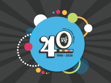
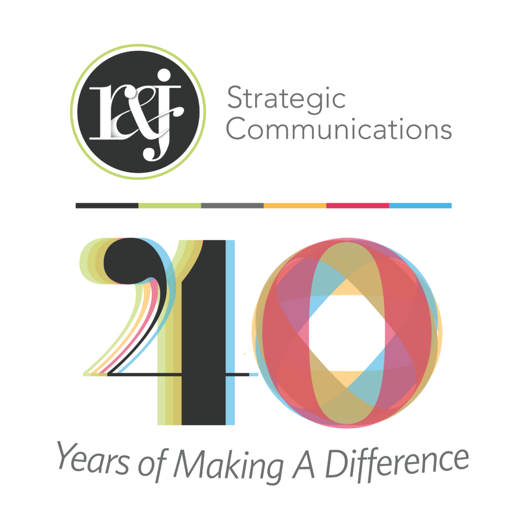
From there, the “4” and “0” were built up in translucent, layered fills drawn from the R&J color palette. I offset the color variants of each number slightly to create a somewhat anaglyphic effect. The forms feel like they still have somewhere to go, which seemed right for an agency that’s never really stopped moving. To balance the complex visual, I chose to set the tagline in the same Whitney from our current logo.
Iteration & Refinement
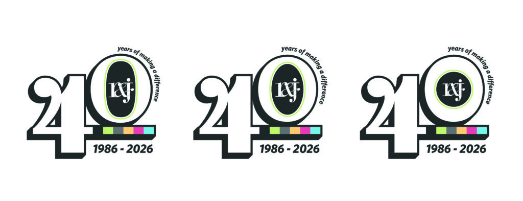
I presented these concepts to our team, and the choice was between concepts B and C. With the notes I had received, I went back to the drawing board and developed three more variations.
Restraint was more of a factor this time around. While muting the colors slightly, I kept the typographic elements and dropped the wordmark since we had the logomark as the focal point for the logo. Ultimately, the Didone-inspired concept was the winning mark. A final adjustment of the counter in the “0” was all that was needed to bring the anniversary logo together.
Connecting to the Future
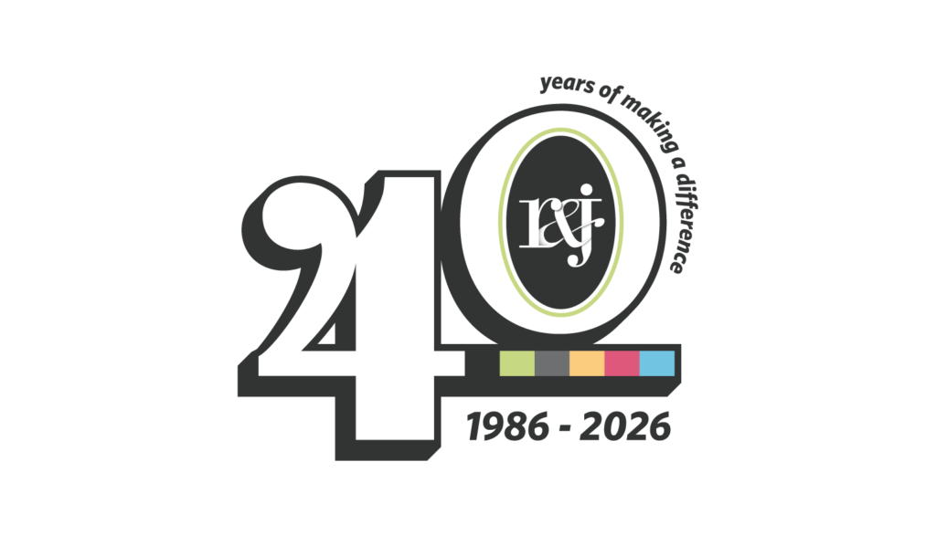
The long, sleek forms of Didone typefaces often impart a sense of elegance and sophistication. Thus, they are often associated with major fashion brands and elite media institutions, including Harper’s Bazaar, Giorgio Armani, Vogue, CBS, and more. We were drawn to the Didone influence because it reflects the discipline of continually refining our craft to meet the demands of a changing communications landscape. Throughout the last forty years, many factors have influenced R&J Strategic Communications as an organization. The industry has changed. The people have changed. The tools have changed. We’ve come a long way and learned to understand the one thing that really hasn’t changed: That the essence of communication is human connection. The evolution of our logo reflects that same story, adapting over time while staying true to the values that have guided us from the beginning.