What’s Your Type?
For most people, font choices began in elementary school. Essays were assigned to be written in Times New Roman, size 12, line spacing 1.5, and half inch margins – no exceptions. Book reports and PowerPoint presentations allowed slightly more flexibility and creativity, enabling many to choose the dreaded Comic Sans as their title or, heaven forbid, their body text.
Regardless, it was a distinct choice that was being made. Children were showcasing their personalities by selecting a text styling that they felt represented their content. Most people do not evolve beyond this point until they’re either picking out their wedding invitations or cultivating a personal or professional brand. At this point of intense soul searching, one of the many choices that you have to make is which font encapsulates your spirit, your mission, your essence?
As someone who picks restaurants based on the appeal of their menu design and logo as opposed to their actual menu items, I can tell you that the way a brand chooses to market itself is of vital importance. To me, a restaurant that cares enough to lay out its menu correctly and display its menu items in a visually pleasing way, cares about the way its food is presented and, in turn, cares about the way the food is made.
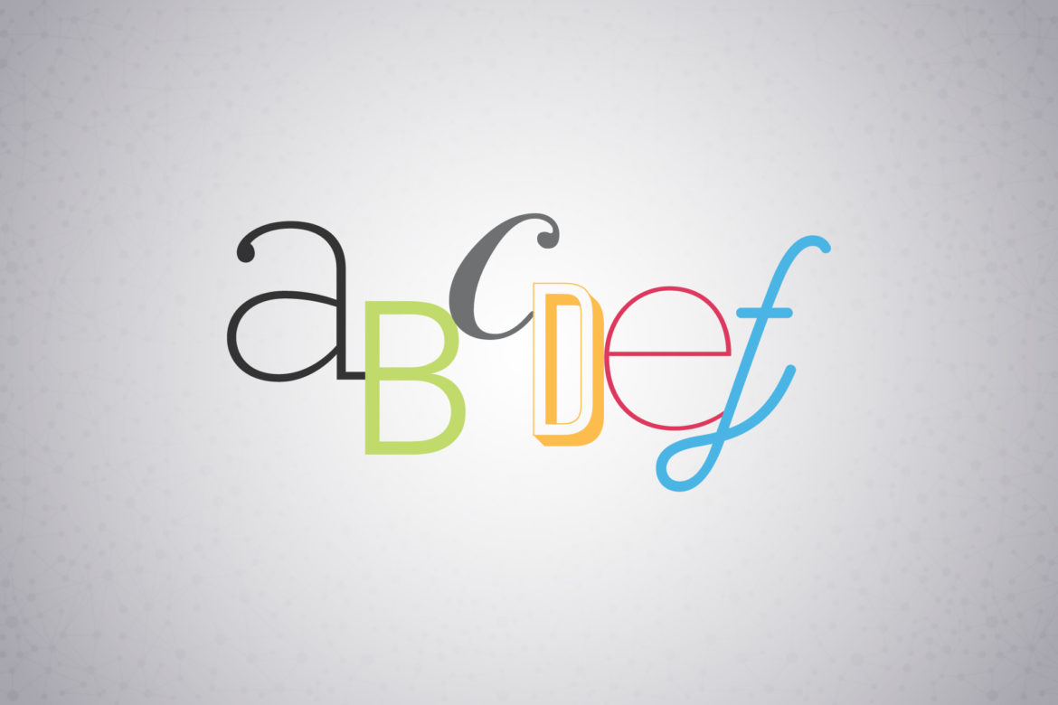
Likewise, the font that a brand or company chooses sets the tone of whichever words they use to represent themselves. Do you want to set a tone of conventionalism or formality? You might want to look into a traditional serif. Do you want to showcase a more modern, minimal approach? Sans serif is for you. Do you want to speak to a youthful, funky audience? You’ll want to research slab serifs. Of course, as always, there are gray areas between these categories and exceptions to the rules. Plenty of serifs can be youthful, many sans serifs are funky. What is critical is this – does this font speak to you and will it speak to your audience?
Most importantly, it is imperative to choose a distinctive and unique font. Simply selecting a standard Microsoft Word font such as Papyrus as your brand logotype is a copout. (Sorry Edible Arrangements.) Choosing something like Helvetica or Arial that is so overused and cliché’ will also not help you to stand out from the crowd. In my view, such selections convey a carelessness and laziness that is easily avoidable. There are so many wonderful (and even free) options out there! So, I invite you to explore the world wide web a bit, you’ll be surprised what you find out there. For specific typography recommendations, my email is jrothschild@randjsc.com. Feel free to reach out!
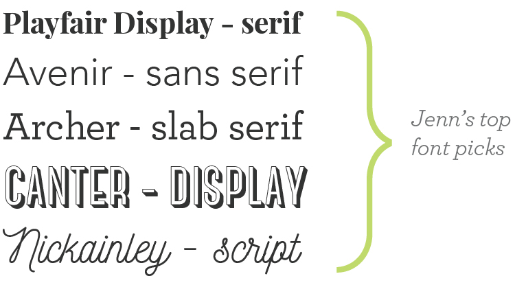
And for those of you who are wondering what some of my favorite fonts are (there are so so many) …