What are the Best Colors for a Logo?
Your logo, the first impression of your brand, is a critical component to telling your story. You’ll want to stand out from your competitors, epitomize your mission statement, be industry appropriate, and speak directly to your audience. Logo design, therefore, is of the utmost importance. However, the shapes, fonts, and elements chosen to represent your brand must be complemented with an appropriate color. A harsh red has a powerful impact as opposed to a tepid steely blue. A lime green tells a much different story from a sage green, for instance. Do you want to wow with an electric shock or calm with a more serene hue?
Something else to consider is how your logo will be presented. If it will be used strictly on letterheads, business cards, envelopes, and other collateral, you’ll likely choose something more minimal or subtle in order to support the content. If you intend to put it on the side of a truck or on the package of a product that needs to pop amongst a sea of other products, you’ll want to choose something vibrant and eye-catching. If you need it to do all of the above, you’ll need to choose a precise color to accomplish all of these goals.
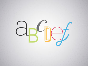
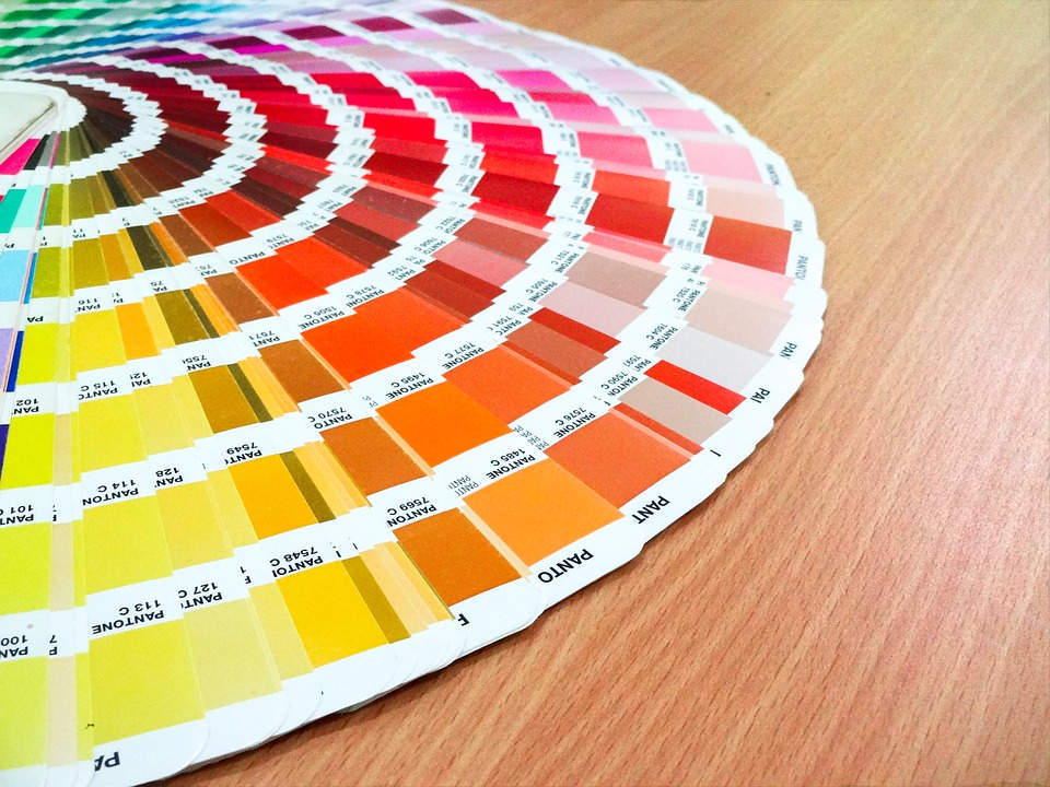
A lot of research has been done on the study of color: you may have noticed that certain industries lean towards certain color palettes. Technology, banking, healthcare, and social media companies tend to utilize blues and greens whereas fast food chains and sports teams typically employ reds and yellows. Many of those who have studied the psychological effect of colors as it pertains to marketing have concluded that each color connotes a certain emotion: yellow is cheerful, red is bold, orange is friendly, blue is reliable, green is healthy, and purple is creative. However, just as important as the color itself, are the tone, tint, and shade of the color. Is the color in its purest and most saturated form? Or would you prefer a lighter, duller, or darker version? These decisions will play a key role in determining your brand identity.
You may be wondering why by this point I haven’t actually advised you on which color to choose for your logo. That is because there is no true answer. You can read the studies and let them guide your decision. You can educate yourself on color combinations, color theories, and the psychological effect of color on the human mind. However, in the end, it is your identity and it is a decision that only you can make. If you feel strongly that a particular shade of indigo truly epitomizes the spirit of your brand, go for it. A graphic designer can then help you flesh out this chosen color into a fully developed palette for your logo as well as the rest of your brand assets.
There is an infamous saying – don’t judge a book by its cover. Nevertheless, in today’s society, first impressions are still very much vital to establishing connections and relationships. Whether or not people judge my book cover, I’d still prefer to have an awesome cover representing my identity. You will want to put your best foot forward, as everyone does; but instead of pandering to a crowd based on research and statistics, stay true to yourself and the human element that your choice provides. When in doubt, go with your gut instinct. Most likely, that is what your audience will be doing as well.