


CHALLENGE
- How do we best explain what the “Partnership” is and the benefits of it
- The current brand look and feel was very dated and felt “old”
- There was no definition about how the various sub-brands within the organization were to be branded
We were able to approach this project with a few really interactive meetings with the entire Somerset County Business Partnership staff where we were able to get a true understanding of each of their perspectives on these challenges. We were able to come away from these workshops with a solid list of goals that would give the overall Partnership a refreshed look and feel and each division within the Partnership tools to make their jobs easier.
ACTION
- One of the main goals here was to help the Partnership better define what they do for their members and how future members can benefit from the partnership. This meant helping to demystify the Partnership to its audience and help define how it varies from a typical Chamber of Commerce. To that end, we reworked the existing tagline to clearly state “Your Chamber of Commerce and more“, so that businesses would have no excuse to not know that the Partnership is more than just a Chamber of Commerce.
- Youth, gone wild: We also wanted to help bring some “youth” and “energy” into the existing brand. The overall partnership look and feel had become very formal and needed some youth breathed into it. We accomplished this by updating the brand fonts to a set of fonts that work well together – where one is a serif font that has a more modern feel to it and one is a sans serif font that helps bring a bit more energy to the typography. Both fonts are able to be used for communications and collateral in various ways. We also updated the Partnership color pallet, from a stale purple and gold to a more vibrant set of purple and gold and a new vibrant grey, accompanied by a full range of supporting secondary colors.
- Connected to the roots: The “S” mark had been used for over a decade and needed to be kept intact so as to not be a complete departure from the history of the organization. To that end, we updated minor nuances of the shape to give a softer feel to the “S”. The changes are so subtle that it’s not a very jarring change, but just enough as to help make it more friendly and welcoming.
CONCLUSION
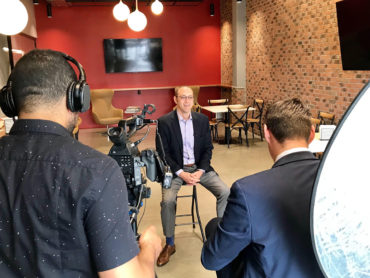
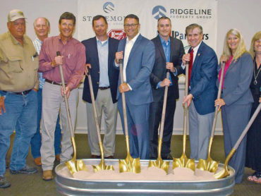
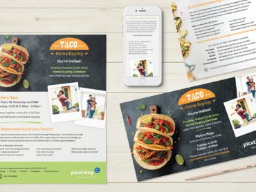
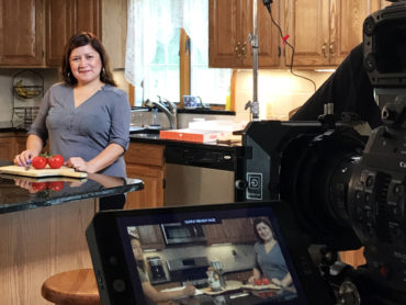
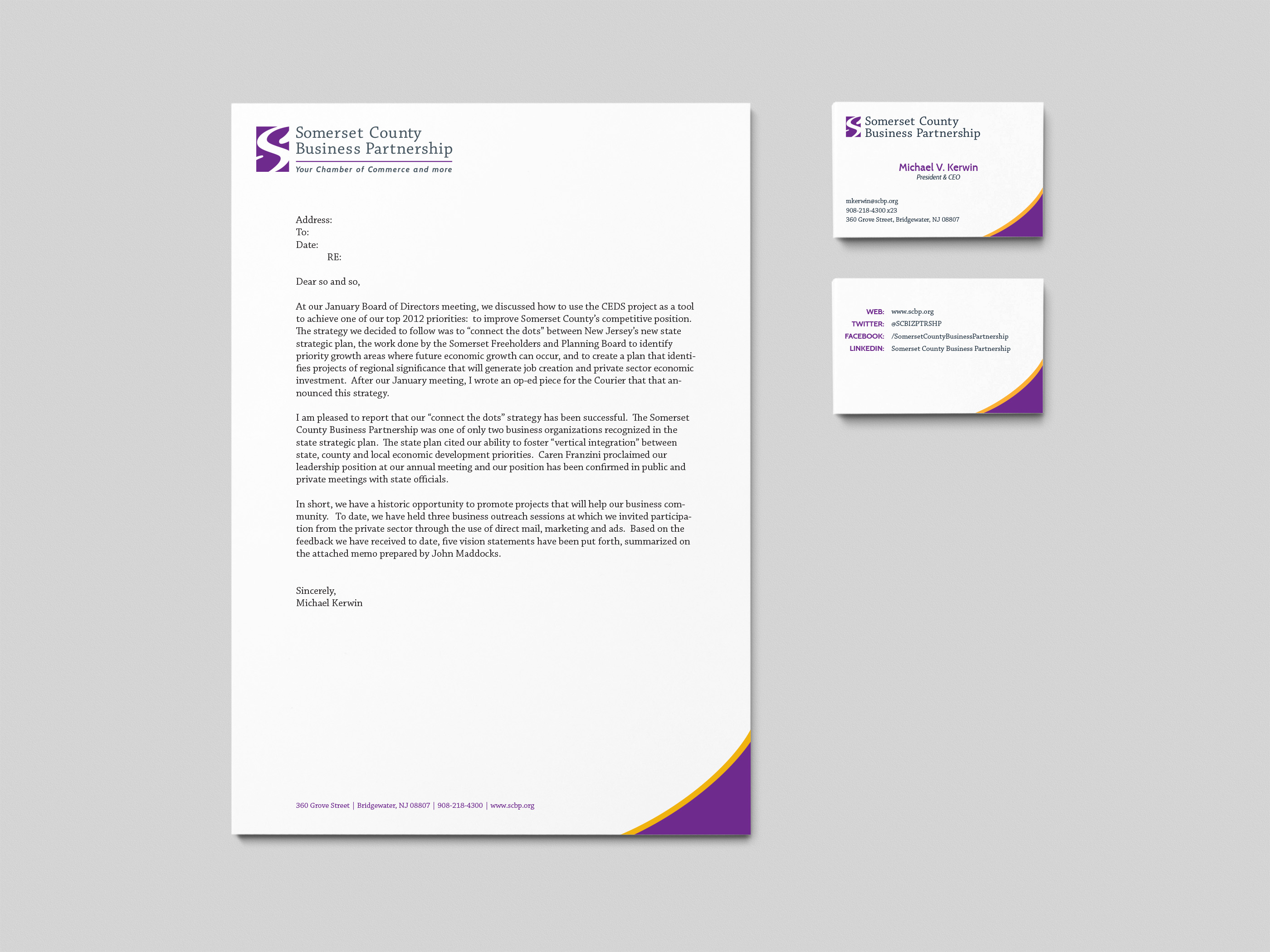
Updating the Partnership logo was only a piece of the brand pie. We had the pleasure of helping execute this updated logo and visual identity into so many aspects of the organization, including a full stationary system, an annual print and online advertising campaign, a set of video testimonials, a custom Facebook content area, a set of digital templates for the organization to use for marketing events, and a series of “child brands” to help each group within the organization stand on its own two feet while being a part of the overall organizational feel.