CHALLENGE
DataMotion provides secure data delivery solutions such as encrypted email. Using DataMotion, businesses can safely and easily exchange email, files and other information with partners and customers in the cloud. Millions of users worldwide in industries such as healthcare, financial services and government rely on DataMotion to transparently improve operational efficiencies and reduce costs, while mitigating security and compliance risk.
When DataMotion approached us to discuss the rebranding, we knew right off the bat that we were a great fit to work together. Initial discussions about a new look for their brand identity went really smoothly and we were all on the same page from the very beginning. DataMotion knew that their existing brand was a very dated logo with an oddly designed accent graphic. The accent graphic was meant to give the notion of “moving data” – but that didn’t work so well. Other issues we identified were that the color pallet was very muted and not exciting and the orientation of the logo was very square and didn’t offer any great way to make it more elongated.
ACTION
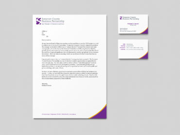
- The DataMotion rebrand was carried through in all of the company’s sales and marketing collateral. Much of it was built into user friendly templates so that the sales and marketing teams could quickly adapt the collateral to their targeted needs. DataMotion’s services cover many industries, and it was important that the message could be geared to each industry on the fly.
- Templates were designed to match the new brand’s look and feel for product manuals, whitepapers and other documents. Using common tools, such as Microsoft Word and PowerPoint, the team can now easily customize their collateral and act on hot sales leads instantly.
- A custom graphics library was designed for use in all sales and marketing presentations. The library allows the sales and marketing teams to easily illustrate how their products work and the benefits that potential customers can expect to gain from using DataMotion’s products.
- All DataMotion product names were designed to match the new brand identity.
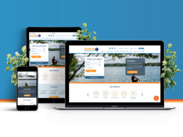
- The new DataMotion brand was carried into the company’s online presence with a website face-lift. View the recently refreshed site here.
CONCLUSION
This project helped to breathe new life into DataMotion’s brand. From the research to the design and implementation phases of the rebrand we were able to identify areas that would allow the DataMotion team to be much more successful in all areas. We were able to build a set of tools based around a visual system that all connected very consistently, leaning on similar colors, fonts, graphics and patterns. It would be very hard to see a piece of DataMotion collateral and not know that is was one of their pieces.