Description
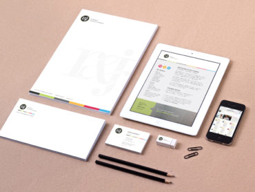
Through the merger of three industry leading company’s, McVeigh Global Meetings and Events (MGME) was in need of a partner to help them define their brand and build a new identity. The R&J team led the MGME team through a full rebranding process, complete with the development of a new set of mission, vision, values and culture. Because they serve a wide array of clients, ranging from pharmaceuticals to the fashion industry and global corporations, the new brand needed to convey professionalism and experience as well as personality and creativity. The key to the success of their new identity was marrying sleek with friendly, bold with reserved.
After exploring several different logotypes, hand lettered lockups, and various iconography, we landed on a lowercase hand drawn semi-script “m” with a connecting symmetrical circle surrounding it, subtly referencing their global business and tying back to their legacy identity. This was then expanded upon with a dynamic gradient and supporting neutral and accented colors.
The sans serif brand font that accompanies this icon was chosen because it complements the compact shape of the “m” while still acknowledging the circle surrounding it with its geometric letterforms.
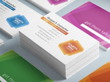
Designing the email signature, letterhead, envelope, and business cards was the next step in the evolution of the McVeigh identity. Incorporating the gradient in a bold and impactful way was very important to the client, so that element is heavily utilized throughout the brand collateral and helps to establish a cohesiveness for the materials. The hot pink was used minimally so that only very specific elements pop out to the audience.